POSTER DESIGN & ANIMATION
Everson Museum Exhibition Poster
My experience partnering with an art museum to create a poster for their Spring 2020 exhibition focusing on growing up in the 21st century.
Role Design, Illustration, Animation Timeline 3 weeks
Role Design, Illustration, Animation
Timeline 3 weeks
.gif?raw=true)
INTRODUCTION
The backstory
In 2018, I was a part of the first Everson Museum Teen Arts Council. This program brought young artists of all sorts together to create two full exhibitions from start to finish, to be displayed in the museum for three months. I learned the balance and forethought that goes into curating a selection of work and worked alongside fellow creatives.
In 2020, right before the onset of the pandemic, I connected with the curators at the museum with an idea in mind: to create the exhibition poster for one of these exhibitions. Truly a full circle moment.
.png)
PROBLEM OVERVIEW
The exhibition theme
The chosen theme of the spring 2020 exhibition was the struggles of growing up in today’s age. Namely, being told over and over to “grow up” without being given the guidance on how to do so. Therefore, the title of the exhibition became: “Grow up? We’re Trying.”
Through my exhibition poster, I needed to address the pains of growing up, while still keeping it youthful, playful and vibrant.
How might we capture the art exhibition’s theme of struggle and growth and portray it in a way that is engaging to audiences of all ages?
IDEATION
The sketching process
I started off with some concepts that focused on the iconic architectural style of the museum building itself (which was designed by I.M. Pei). I also played around with using the typography to show the struggle of growing. However, both of these concepts seemed to be lacking the human element that was central to this exhibition.
.gif)
IDEATION
The plot thickens
I moved forward with this idea that I wanted to show a playful, engaging, human struggle. I also couldn’t shake my attraction to playing with the typography and incorporating it into the illustration.
So I combined the two.
.gif)
DESIGN ELEMENTS
The characters
In a previous project, focusing on Sigmund Freud, I had used randomized scribbles to communicate entropy, chaos, and disorganization. Fresh off of this past project, I decided to bring this design element back into the limelight one more time, in the form of typography filling.
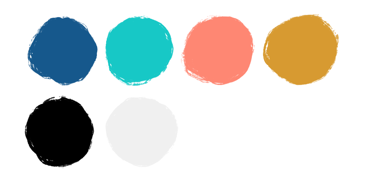
My color palette was iterated off of a primary color palette, but lighter (and therefore, more youthful than primary): red became coral, blue became aqua, and yellow became gold.
IMPACT
The conclusion
The physical exhibition ended up being put on pause when the pandemic forced everyone home in March 2020. However, the exhibition was already organized and this poster already completed, so it was decided to host the exhibition online. I adapted the poster accordingly, to include information on how to find the digital exhibition as well as add a simple looping animation. The animation allowed the museum to have an eye-catching moving graphic that otherwise would not have been useful in a print-only use.