TYPE DESIGN
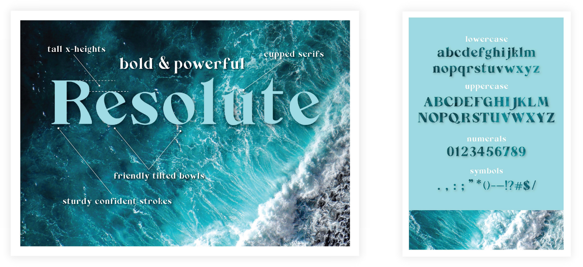
Resolute Bold
My experience designing my own, fully-functional, serif display typeface from scratch, and then showcasing it in a typography exhibition with 3D-printed glyphs.
Role Designer Timeline 15 weeks
.gif)
PROJECT OVERVIEW
The backstory
In a world with endless typography possibilities, I was tasked with creating my own typeface from scratch. To make it more challenging, it was to be styled from the personality of a person within my school.
It required deep analysis of what makes a font successful and the tiny details that can make it wonky or balanced. The process stretched from type analysis, to sketching, to creating the actual glyphs, to testing the type in action—and repeating the process until finished.
How might we design a custom typeface that captures the personality and energy of an individual?
IDEATION
Sketching 'hamburgfonstiv'
In the early phases of sketching this typeface, I focused on creating a classic serif typeface, with open and friendly characteristics. After an interview with my muse, the Director of Academic Operations in my school, I also chose to make it a bold typeface. This reflects the strong, dedicated, and personable personality traits I observed.
“Hamburgerfontstiv” is a string of letters I used to test out the relationship with common glyph pairs. It also provided a sample of the most common glyph elements that could be adapted to create the rest of the alphabet.
.gif?raw=true)
IDEATION
Creating the glyphs
From the sketching phase, I slowly made progress in creating the glyphs in Glyphs Mini, a type creation software.
.gif)
IMPACT
The conclusion
As any type designer will tell you, this process of testing and tweaking could go on in an endless cycle of perfecting. This project showed me the impact of tiny details, how a few seemingly minor details can combine to create the entire tone of the typeface. I learned how changing one part of a glyph has the potential to mess it all up, or, open up a new direction. It’s all about experimenting.
Even though this typeface is far from perfect, feel free to download it here and play around with my “Resolute Bold” type experiment here.
